Tutorial: Fixed Effects models
Categories → Study Design, Tutorial
This tutorial will demonstrate the Fixed-Effects models available in Causal Wizard with 3 examples.
Tutorials
To illustrate and explain the Fixed-Effects models available in Causal Wizard, we will work through 3 of the examples described in Matheus Facure's excellent Python Causality Handbook - "Causal Inference for the Brave and True". Each example has a downloadable dataset - just upload it and create a new Study against it.
- Example 1 is from Chapter 14, titled "Visualizing Fixed Effects". It shows how a simple regression fit to the data would be misleading, and produce an effect with the wrong sign! We then show how including the fixed-effects of each city, we are able to recover the correct effect.
- Example 2 is from Chapter 24 - "The promise of Panel Data". This example describes a company rolling out a new feature to users in different cities at different times, and trying to work out whether the feature increases sales - and by how much.
- Example 3 is from Chapter 13, titled the "DiD Estimator". It is a very simple introduction to the Difference-in-Differences method, but we will use it to show how DiD can be obtained with Causal Wizard, using the Fixed-Effects models. In Chapter 13 Matheus Facure also derives and demonstrates the equivalence between the OLS regression method used in Causal Wizard and the literal "difference in differences" calculation, which gave the method its name.
Essential Concepts
To understand the methods and ideas explored in these tutorials, it would help to read:
- Fixed effects models
- Panel Data format
To summarize, Fixed-Effects models are commonly used in Econometrics to conduct a "quasi-experiment" to obtain a causal effect estimate, or to establish a cause-and-effect relationship.
Usually, several Entities (maybe individuals, but often groups) are observed over a period of time, resulting in multiple measurements of each Entity or group. This is a more generalized form of the popular Difference-in-Differences (DiD) technique, where the number of groups and time periods is relaxed from 2, to any number. Given this experiment design, the data is typically in Panel Data format.
Example 1: Visualizing Fixed-Effects
- Original data source - Chapter 14. Download: tutorial-fe-1-toy-panel.csv.
Introduction & objectives
Imagine you wanted to explore the effect of Treatment: "marketing costs" on Outcome: "purchases" across four cities where you have shops.
This example utilizes a synthetic dataset to illustrate how misleading a simple regression model can be. Simply fitting a regression line to all the data predicts that higher marketing spend causes fewer purchases! What?!
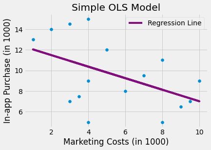 But this picture is misleading, because as we can see, the data is grouped into four cities, and within each city, higher marketing spend causes more purchases!
If we add a "fixed-effect" to the model for each city (city indicated by dot colour), the resulting regression model predicts these straight purple lines, which indicate the effect of marketing spend has reversed:
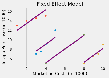 This example shows that Entity Fixed-Effects (in this case, the Entities are cities) improve the regression model to more accurately predict purchases given marketing spend. In fact, this is an example of Simpson's Paradox.
We can reproduce the same result in Causal Wizard.
Steps
- Upload the dataset above via the Data page.
- Click Studies in the menu bar, name your study (e.g. "FE example 1"), select the dataset, and press Create.
- Change Method to Panel Data with Fixed Effects.
- Set Treatment to mkt_costs and Outcome to purchase.
- Click Treatment groups. Since our Treatment variable is a continuous numerical value (marketing costs), select Use as a continuous value.
- In the Counterfactual value fields that appear, enter 2 as the lower (control) value and 5 as the upper (treated) value. Although we have a continuous, numerical Treatment rather than a Binary (case-control) study design, we can still obtain counterfactual estimates at these two set-points for the Treatment variable.
- Under Panel data structure, set Entity column to city. The fixed-effects of city will be accounted for in the model separately to the effect of Treatment.
- Leave Time column unset. There is no time concept in this dataset. The other examples do consider time.
- Leave Covariates empty.
- Press Check. You should be offered one model - Fixed Effects: Linear Regression.
- Click Download config JSON, then open the notebooks (Open in Colab, or clone the repository) and run both top to bottom, providing your config file and data file when asked.
Reviewing the result
Causal Wizard's notebook provides a range of analyses of your data and model, but scroll down to the Outcomes plots section, to the scatter plot of predicted vs actual outcomes:
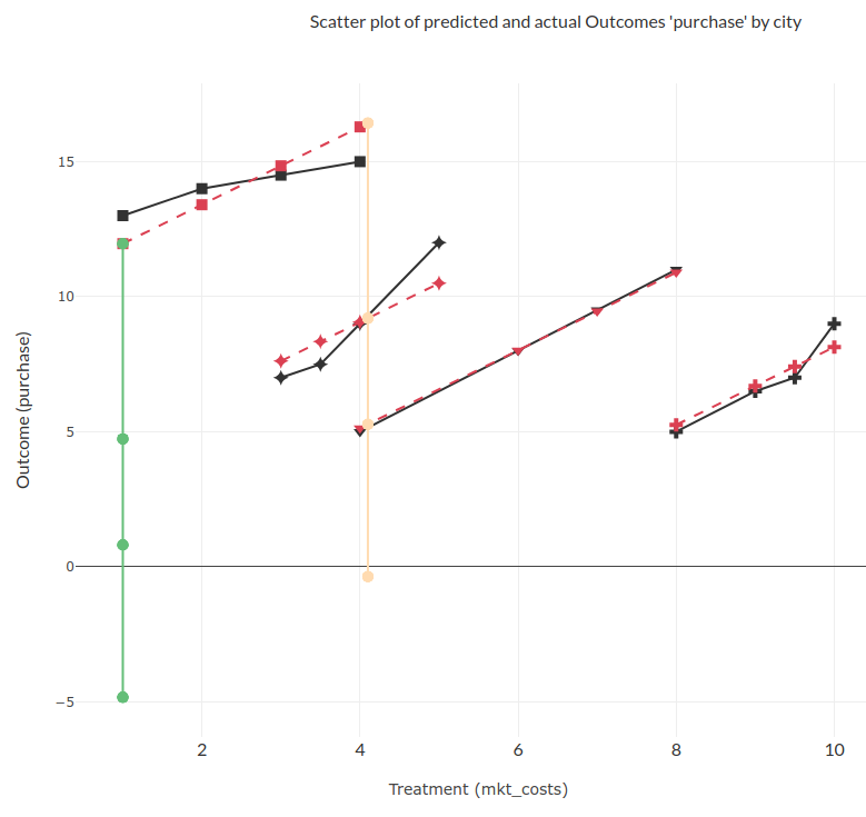
This plot looks a lot like the correct model in the second image from Matheus Facure's original article! Great.
- Grey "Observed" points are the actual data.
- Dark red "x" points are the model's own predictions for the same rows.
- The light green and light orange series are the counterfactual predictions at your two Treatment setpoints (2 and 5) - for panel data, each entity's points are joined by a line, so you can trace one city's predicted response across treatment values.
There are some other sections of the notebook worth a look:
- Counterfactual outcomes table: the result of setting the Treatment value to your two setpoints for every sample, numerically.
- Validation and refutation tests: for a Fixed-Effects model, this includes the z-statistic (for each input variable, i.e. model coefficient) and the F-statistic (for the model overall).
- Feature importance: a bar chart of the fitted model's own coefficients - useful here to directly see the size of each city's fixed effect.
Challenge
What would happen if you leave Entity column unset? (Tip: The model would behave similarly to the first regression model displayed in the introduction - the incorrect one.)
Example 2: The Promise of Panel Data
- Original data source - Chapter 24. Download: tutorial-fe-2-installs.csv.
Introduction & objectives
This example creates a Two-Way Fixed Effects (TWFE) model with both Entities and Time. The experiment design is Binary (Case/Control groups). From the original article, the problem is described as follows (emphasis added):
"Panel data methods are often used in government policy evaluation, but we can easily make an argument about why they are also incredibly useful for the (tech) industry. Companies often track user data across multiple periods of time, which results in a rich panel data structure. Not only that, sometimes experimentation is not possible, so we have to rely on other identification strategies. To explore that idea further, let’s consider a hypothetical example of a young tech company that tracks the number of people that installed its app across multiple cities.
At some point in 2021, the tech company launched a new feature in their app. It now wants to know how many new users that feature brought to the company. The rollout was gradual. Some cities got the feature in 2021-06-01. Others, in 2021-07-15. The full rollout to the rest of the cities only happens in 2022. Since our data only goes up until 2021-07-31, this last group can be considered the control group. In causal inference terms, rolling out this feature can be seen as the treatment and number of installs can be seen as the outcome. We want to know the treatment effect on the outcome, that is, the effect of the new feature on the number of installs."
In the data provided, the variable treat indicates whether users in a city received the feature (1 = yes, 0 = no).
Steps
- Upload the dataset above via the Data page.
- Create a new Study against it, and change Method to Panel Data with Fixed Effects.
- Set Treatment to treat and Outcome to installs.
- Click Treatment groups and confirm 0 is Control and 1 is Treated - the default.
- Under Panel data structure, set Entity column to unit. The fixed-effects of each individual unit will be accounted for in the model separately to the effect of Treatment.
- Set Time column to date. This will be a Two-Way Fixed-Effects model (Entities and Time).
- Leave Covariates empty.
- Press Check. You should be offered Fixed Effects: Linear Regression.
- Download the config file and run it through the notebooks as before.
Reviewing the result
In this case, the data is synthetic and we know the true causal effect, which is 1. In the Findings section, you should see this reported - verify the result is correct. As in the previous tutorial, we should also check our validation and refutation tests.
Since this example includes Time, we next want to have a look at the Outcomes over time plot. This includes a plot, which at first will look very busy - because we are currently modelling individual fixed effects for each of the many units, and every one of them is plotted.
These plots are generated using Plotly.js. We can select series by clicking in the Legend; double-clicking a series will cycle through hiding it, showing it, and showing all series. By selecting only the series for one unit we can see 4 series for it:
- Actual observations (solid line with markers)
- Predicted observations (dashed line)
- Predictions given treatment is Control (0) - light green
- Predictions given treatment is Treated (1) - light orange
For a unit that switches from Control to Treated partway through the data, you should be able to see the predicted and observed values track from the Control level up to the Treated level, at the point the unit was actually treated.
Additional Analysis
There are numerous other results to review. You could also simplify the plot by re-running with a coarser Entity column - if your data has a city/cohort column, set Entity column to that instead of unit, re-check, re-download the config, and re-run. This produces a plot more similar to the one in Matheus Facure's book, with one line per city rather than per individual unit - but the estimated causal effect will be a little different, because you're no longer controlling for the same effects. You could consider this model "wrong" because it isn't controlling for the same effects as the unit-level one, but it's a good idea to explore a range of related model configurations to ensure they all behave as you'd expect.
Example 3: The Difference-in-Differences (DiD) estimator
- Original data source - Chapter 13. Download: tutorial-fe-3-billboard.csv.
Introduction & objectives
This third example is actually the simplest. It is introduced in Chapter 13 to show the equivalence of DiD and regression under certain conditions, namely binary treatment design, 2 time periods, and 2 groups of entities with one group treated in the second time period. We will use it for the same purpose, to show how a DiD result can be obtained in Causal Wizard.
The data has 4 columns:
- deposits: The outcome we want to estimate.
- poa: The entity group. Value is 1 if the sample is from Porto Alegre (POA) and 0 if from Florianopolis, the other city.
- jul: The month indicator: Either 0 (May: pre-intervention) or 1 (July: Post-intervention).
- treated: An "interaction term" column, simply
poa * juli.e. 1 iff post-intervention and city Porto Alegre. These samples are the only ones which are treated. If you use Causal Wizard for DiD on your own data, you'll also need to add an interaction term like this.
With that data, we want to estimate the effect of Treatment on Outcome: deposits. Note that both poa and jul only take 2 values each, so many individual samples (bank branches) share the same entity and time - that's completely fine for a Fixed Effects model; see Panel Data format for why repeated entity/time combinations don't need to be unique.
Steps
- Upload the dataset above via the Data page.
- Create a new Study against it, and change Method to Panel Data with Fixed Effects.
- Set Treatment to treated and Outcome to deposits.
- Click Treatment groups and confirm 0 is Control and 1 is Treated - the default.
- Under Panel data structure, set Entity column to poa. The fixed-effects of each city will be accounted for in the model separately to the effect of Treatment.
- Set Time column to jul. This will be a Two-Way Fixed-Effects model (Entities and Time).
- Leave Covariates empty.
- Press Check. You should be offered Fixed Effects: Linear Regression.
- Download the config file and run it through the notebooks as before.
Reviewing the result
In this case we have a "correct" result from Matheus Facure's article, which we expect to obtain: 6.52. This is the value of the interaction coefficient (treated variable) he obtained from both the simple DiD calculation, and OLS regression.
Your result should be somewhere close to this, but probably not exactly right. Why is that?
As part of Validation, Causal Wizard's notebook automatically holds back some data for generalization testing, by default a random 20% of your data. To reproduce the original result exactly, we must use all our data for training the model.
- Go back to your Study.
- Open Advanced options at the bottom of the page.
- Set Held-out test set (%) to 0. This disables the test set.
- Press Check again, download the new config file, and re-run the notebooks.
The new causal effect should now be 6.52 (or very close to it).
Parallel Trends plot
One of the important assumptions to check in a DiD study is the parallel trends assumption: absent treatment, both/all Entity groups would have experienced the same change in Outcome. The Outcomes over time plot is intended to visualise this and help you confirm it. It has up to 4 series per Entity:
- Actual observations (solid line with markers)
- Predicted observations (dashed line)
- Predictions given treatment is Control (0) - light green
- Predictions given treatment is Treated (1) - light orange
In the case of DiD, we want to confirm that the trend for the Treated entity (city of POA) is similar to the trend for the Control entity (city FL). Since we only have 2 time points, we can't verify this visually here - but in your own data, you may have multiple time periods, and the Causal Wizard model will work just as well; you'll see all time points in the chart, and duplicate entity/time rows are automatically averaged before plotting.
The plot shows counterfactuals and predictions so you can compare model predictive behaviour to observations, and visualize the effect of your intervention (treatment).
Above: the outcome-over-time plot should show the prediction for city POA (entity=1) rising from the Control level to the Treated level between May and July. The actual data should match this behaviour closely. In contrast, city FL's (entity=0) prediction line should remain at the Control level throughout, since it was never treated.
Related articles
-
Assumptions
-
Average Treatment Effect (ATE)
-
Average Treatment Effect on the Treated (ATT)
-
Bias
-
Causal Effect
-
Cohort
-
Common Cause (variable)
-
Conditional Average Treatment Effect (CATE)
-
Control and Treated values for Treatment variable
-
Counterfactual
-
Data types
-
Dimension (Data)
-
Directed Acyclic Graph (DAG)
-
do-Calculus
-
Domain Knowledge
-
Double ML
-
Estimand
-
Estimate
-
Estimation
-
Expected value
-
Experiment
-
Fixed Effects models
-
Graph (mathematics)
-
Identification
-
Independent and Dependent variables
-
Inference (Statistics and Causal Inference)
-
Instrumental Variables (Method)
-
Intervention
-
Local Average Treatment Effect (LATE)
-
Machine Learning
-
Model (Statistics and Machine Learning)
-
Model Selection
-
Observational data / studies
-
Observed / unobserved variable
-
Outcome (variable)
-
p-values (Significance testing)
-
Panel Data format
-
Placebo treatment refuter
-
Potential Outcomes Framework
-
Random Common Cause Refuter
-
Randomized Controlled Trial (RCT)
-
Research Question
-
Result
-
Sample (Sample Unit)
-
Study
-
Study Design and Method options
-
The Positivity Assumption
-
Treatment (variable)
-
Tutorial 1
-
Tutorial 2
-
Tutorial 3
-
Tutorial 4
-
Validation
-
Variables