Tutorial 1
Does tertiary education increase lifetime wages, and if so, how much?
Introduction
Step 1: Get the data
Download tutorial-1-education-wages.csv, then upload it via the Data page (name it whatever you like, e.g. "Tutorial 1"). See Dataset if you haven't uploaded a file before.
Step 2: Create a new Study
- Click on Studies in the menu bar.
- Under Create a new study, give it any name you like (e.g. Tutorial 1).
- Select the Dataset you just uploaded.
- Click Create and the new Study will open.
Step 3: Specify Treatment and Outcome
In this case study our treatment is the variable Education (number of years' education) and the Outcome we're interested in is Weekly Wage. Specifically, we're interested in estimating the effect on wages of having more than the standard 12 years education.
Since Education is a whole number (integer) value rather than a true/false property, we need to specify a threshold to group our sample into Control (<= 12 years' education) and Treated cohorts (> 12 years' education).
- Set Treatment to Education, and Outcome to Weekly Wage.
- Click Treatment groups to open the group editor.
- In the Treated row, set the lower bound operator to > and enter 12.
- Leave the Control row's upper bound as < and enter 12 (so Control is ≤ 12 and Treated is > 12 - a histogram below the editor updates live so you can check the split makes sense).
Step 4: Draw Causal Diagram
The next step is to tell Causal Wizard how these variables interact. Following the textbook, we assume that:
- Education affects Wages
- Intelligence (measured as IQ) affects both Education and Wages
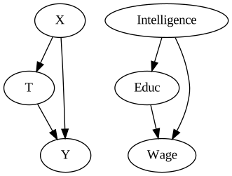
The claim here is that people who are more intelligent (if IQ measures such a thing) are more likely to spend more time in education, but also that intelligence also directly affects wages.
However, the effect we're interested in is the effect of Education, not Intelligence. How can we separate these effects?
The simple answer is that we draw the diagram corresponding to our beliefs listed above.
- In the Causal diagram panel, make sure Edit nodes is selected, then click somewhere empty. A dialog will appear.
- In the Variable selector, select Education. Click Save.
- Repeat to add a node for Weekly Wage, and another for IQ (representing intelligence).
- Now we need to draw the edges (arrows).
- Click the Draw edges toggle button above the diagram.
- Click and drag from Education to Weekly Wage. This represents the direct effect.
- Click and drag from IQ to Education.
- Click and drag from IQ to Weekly Wage.
Step 5: Check the setup and download your config
- Press the Check button at the top of the page.
- If something is not right, you'll get some warning messages - follow their instructions to complete or fix the setup.
- If everything went as planned, a dialog will confirm your diagram and data support estimating this effect, and offer a choice of Model. Select "Backdoor: Linear regression". (This tutorial won't cover model selection criteria - see Model Selection if you're curious.)
- Click Download config JSON, and note the link to your uploaded data file (you already have this).
Step 6: Run the notebook
Click Open in Colab (or clone the linked notebooks repository to run locally). When the notebook asks for your config file and data file, upload the two files from Step 5. Run every cell from top to bottom - Runtime → Run all in Colab.
The notebook re-checks everything independently and doesn't just trust the site, so if anything here turns out to be a poor fit for your data, it'll tell you there too. Once notebook 1 finishes, open notebook 2 and run it the same way - it picks up the results automatically.
Step 7: Reviewing the results
Scroll to the Findings section first. You should see something like:
First, the causal effect was estimated as approximately 144.85, with a 95% confidence interval of roughly 102 to 189 (your exact numbers will vary slightly, since Causal Wizard's notebooks re-fit the model on your data with a random held-out test split each time). This means that in stability testing, 95% of the results on different subsamples fell in this range. The units of the result are whatever the original outcome units were (in this case, weekly wages).
Next, look at the Outcomes plots section. Since this is a binary (Control/Treated) design, you'll see a box plot comparing the two cohorts' outcome distributions side by side - you can see that the distribution of weekly wages for Treated is different and higher than for Controls.
Now scroll to the Refutation / validation section, presented as a table with an "Estimate valid?" column telling you, at a glance, whether each test supports or undermines the result. Causal Wizard's validation tests are quite strict, and it is common for some of these tests to fail - look especially closely at those.
The remaining sections explain the assumptions made, the modelling process, and document the Causal Diagram you provided.
Step 8: What if we didn't consider intelligence?
Let's explore what would have happened if we didn't consider intelligence - perhaps because we wonder whether it really does cause an increase in education, or wages. We now think it's irrelevant to everything.
It's often useful to model several different Causal Diagrams to answer questions about possible confounding. Let's modify this Study and generate a new set of results.
- Go back to your Study (Studies in the menu bar, then open "Tutorial 1" again).
- Above the Causal Diagram editor, click Draw edges.
- Click on the edge between IQ and Education to delete it.
- Click on the edge between IQ and Weekly Wage to delete it.
- Click Check. There should be no issues, and Backdoor: Linear Regression should still be selected.
- Download the new config file, and run it through the notebook again exactly as before (you can reuse the same data file).
We found that by removing these edges, the estimated effect of education on wages increased from 144 to 229. Which result is more correct? The answer depends on your prior assumptions, encoded in the causal diagram.
This shows how important your domain knowledge is, in the form of the causal diagram, selection of data, and in the interpretation of the results. While Causal Wizard's notebooks will calculate these effects for you, your judgement and review is even more important. Review the results closely, and critically. Feel free to contact us if you want to discuss one of your results.
Tip: You may also want to experiment with removing only the edge between IQ and Education, and allowing IQ to still affect wage. What happens to the estimated effect of education on wages?